Kelvin Color Temperature
Light is a fundamental aspect of our daily lives, shaping our perception of the environment and influencing our moods and activities. One of the key characteristics of light is its color temperature, which is measured in Kelvin (K). The Kelvin color system is an essential concept in lighting, helping us understand the different hues of light and their effects. This article delves into the origins of the Kelvin color system, explains the terms used in modern lighting, and provides insights into how light color works.
Origins of the Kelvin Color System
The Kelvin color system originated from the study of blackbody radiation, a concept in physics that describes the color of light emitted by an idealized object known as a “blackbody”. A blackbody is an object that absorbs all incident radiation and re-emits it as thermal radiation. As the temperature of a blackbody increases, the color of the emitted light changes.
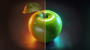
This phenomenon was first described by physicist William Thomson, also known as Lord Kelvin, in the 19th century. He developed a temperature scale, now known as the Kelvin scale, to measure the color temperature of light. The Kelvin scale starts at absolute zero (0 K which is roughly equivalent to -450°F or -273°C), the theoretical point where all molecular motion ceases. As thermal energy (temperature) increases so does the color. An example of this can be seen in flames, which range between orange and blue. In the context of lighting, color temperature refers to the hue of light produced by heating a blackbody to a specific temperature.

Understanding Light Color
When a blackbody is heated, it emits light that changes color with increasing temperature. At lower temperatures, the light appears reddish, and as the temperature rises, it shifts to orange, yellow, white, and eventually blue. This progression is similar to the way metal glows when heated: it starts with a dull red glow and transitions to a bright blue-white glow at higher temperatures.
The color temperature of light sources is measured in Kelvin (K), and it provides a way to describe the color appearance of the light. Here is a breakdown of the color temperatures and their associated hues.
Color Temperatures and Hues
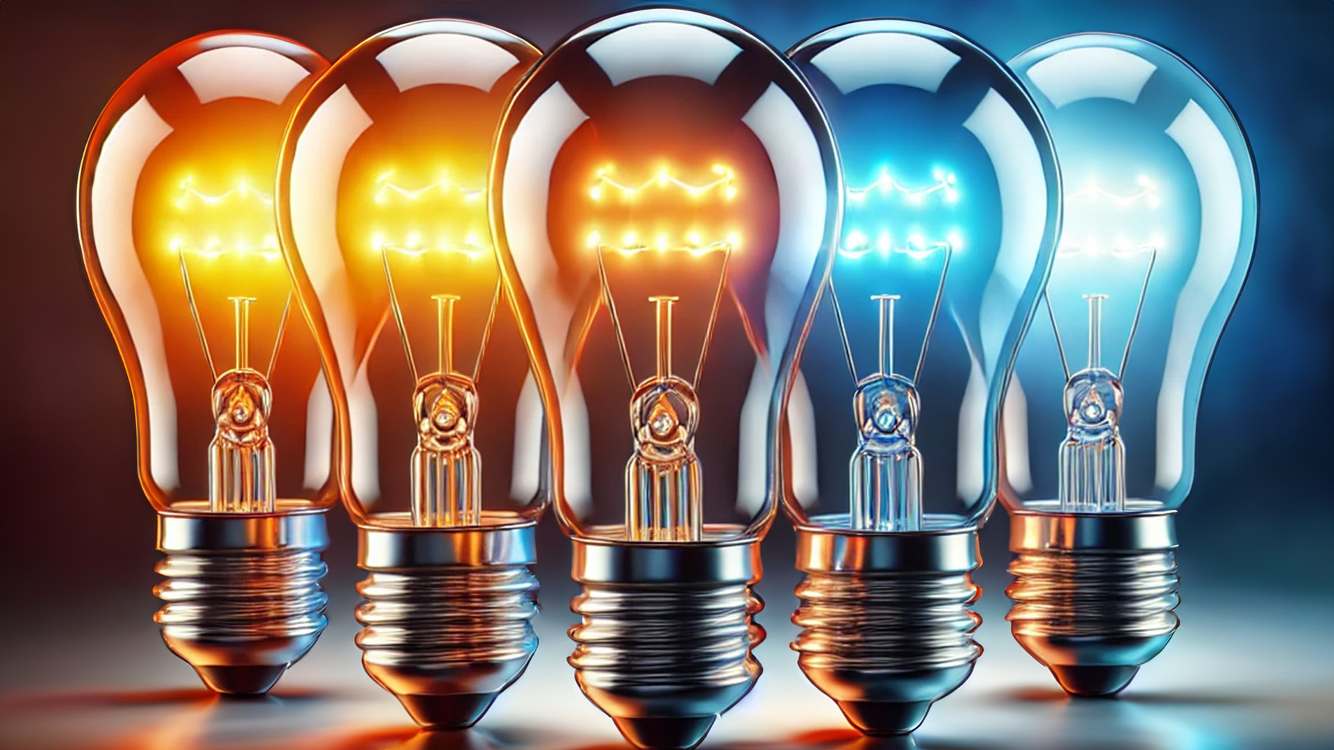
- 1,000 K to 2,700 K (Warm White): This range includes the reddish-orange hues of candlelight and incandescent bulbs. It is often referred to as “warm” lighting because it creates a cozy and inviting atmosphere. Warm light is commonly used in residential settings, restaurants, and hospitality environments.
- 2,700 K to 3,500 K (Neutral White): As the color temperature increases, the light becomes less red and more yellow. This range is considered “neutral” or “soft white” lighting. It provides a balance between warm and cool tones and is suitable for living spaces, retail environments, and offices.
- 3,500 K to 4,500 K (Cool White): Light in this range appears more neutral with a slight bluish tint. It is known as “cool” lighting and is often used in workspaces, hospitals, and areas requiring clear visibility and focus.
- 4,500 K to 6,500 K (Daylight): This range includes the bright, blue-white hues similar to natural daylight. It is referred to as “daylight” lighting and is ideal for tasks requiring high color accuracy, such as graphic design, medical procedures, and art studios.
- Above 6,500 K (Blue Light): At these higher temperatures, the light appears distinctly blue. While not commonly used in general lighting, it is found in specialized applications like aquarium lighting and certain industrial processes.

Terms Used in Modern Lighting
Understanding the terms used in modern lighting helps consumers and professionals choose the right lighting for their needs. Here are some common terms associated with Kelvin Color Temperature:
- Warm Light: Refers to light with a color temperature below 3,000 K. It has a yellowish to reddish hue and creates a comfortable, relaxing atmosphere.
- Cool Light: Refers to light with a color temperature between 4,000 K and 5,000 K. It has a bluish tint and provides a crisp, energizing illumination.
- Natural Light: Often used to describe light with a color temperature around 5,000 K to 6,000 K, mimicking the appearance of natural daylight.
- Color Rendering Index (CRI): A measure of how accurately a light source reveals the colors of objects compared to natural light. A higher CRI indicates better color rendering, with a maximum value of 100.
- Correlated Color Temperature (CCT): A specification used to describe the color temperature of a light source, indicating whether it appears warm, neutral, or cool.
The Impact of Light Color on Human Perception and Well-Being
The color temperature of light significantly affects human perception, mood, and well-being. Different lighting conditions can evoke various emotional responses and influence productivity and comfort levels.
- Warm Light: Creates a cozy and inviting ambiance, making it suitable for living rooms, bedrooms, and dining areas. It promotes relaxation and a sense of comfort.
- Cool Light: Enhances focus and alertness, making it ideal for workspaces, kitchens, and bathrooms. It is also beneficial in areas where tasks requiring attention to detail are performed.
- Daylight: Provides a bright and vibrant illumination, closely resembling natural sunlight. It is preferred in environments where accurate color perception is crucial, such as art studios and medical facilities.


Bars and Nightclubs
Bars and nightclubs often use colored lighting to create a dynamic and vibrant atmosphere. The use of red, blue, and purple lights can evoke excitement and energy, making these venues appealing for social interactions and dancing. These colors are chosen because they can make the space feel lively and intriguing. For example:
- Red Light: Enhances feelings of passion and excitement.
- Blue Light: Can create a sense of calm and relaxation, balancing the intensity of red light.
- Purple Light: Combines the energy of red and the calmness of blue, creating a sense of mystery and luxury.
Museums
Museums use lighting strategically to highlight exhibits and create a comfortable viewing experience. Cool white light (around 4,000 K to 5,000 K) is often used to ensure accurate color representation of the artworks and artifacts. This type of lighting enhances the visual appeal of exhibits without causing eye strain. Additionally, the lighting can be adjusted to highlight specific pieces, drawing visitors’ attention and creating focal points.
Hospitals
Hospitals require lighting that promotes alertness and reduces fatigue among staff while providing comfort to patients. Cool white light (around 4,500 K to 5,500 K) is used in operating rooms and patient areas to enhance visibility and create a clean, sterile environment. Studies have shown that exposure to daylight-like lighting can help regulate circadian rhythms, which is beneficial for patients’ recovery and well-being.
Residential Spaces
In homes, warm white light (around 2,700 K to 3,000 K) is commonly used to create a cozy and inviting atmosphere. This lighting is ideal for living rooms, bedrooms, and dining areas where relaxation and comfort are paramount. For instance:
- Living Rooms: Warm light creates a welcoming environment for social gatherings and relaxation.
- Bedrooms: Soft, warm light helps create a calming atmosphere conducive to rest and sleep.
- Kitchens and Bathrooms: Neutral white light (around 3,500 K) provides good visibility while maintaining a warm feel.
Conclusion
The Kelvin Color Temperature system is a vital tool in the world of lighting, helping us understand and choose the appropriate light color for various applications. By measuring the color temperature in Kelvin, we can create environments that enhance comfort, productivity, and well-being. Whether you are selecting lighting for your home, office, or commercial space, understanding the principles of the Kelvin color system will ensure you achieve the desired ambiance and functionality. Check out the article “Color Rendering Index (CRI) in Lighting” next!