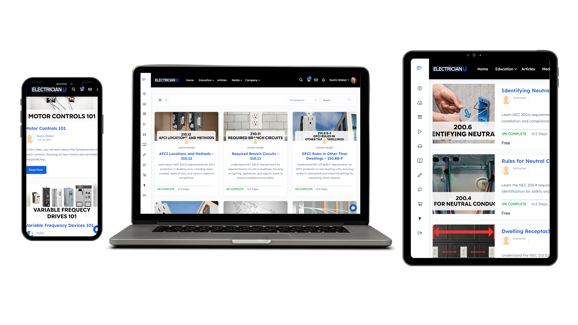
Learning System
Electrician online courses and videos
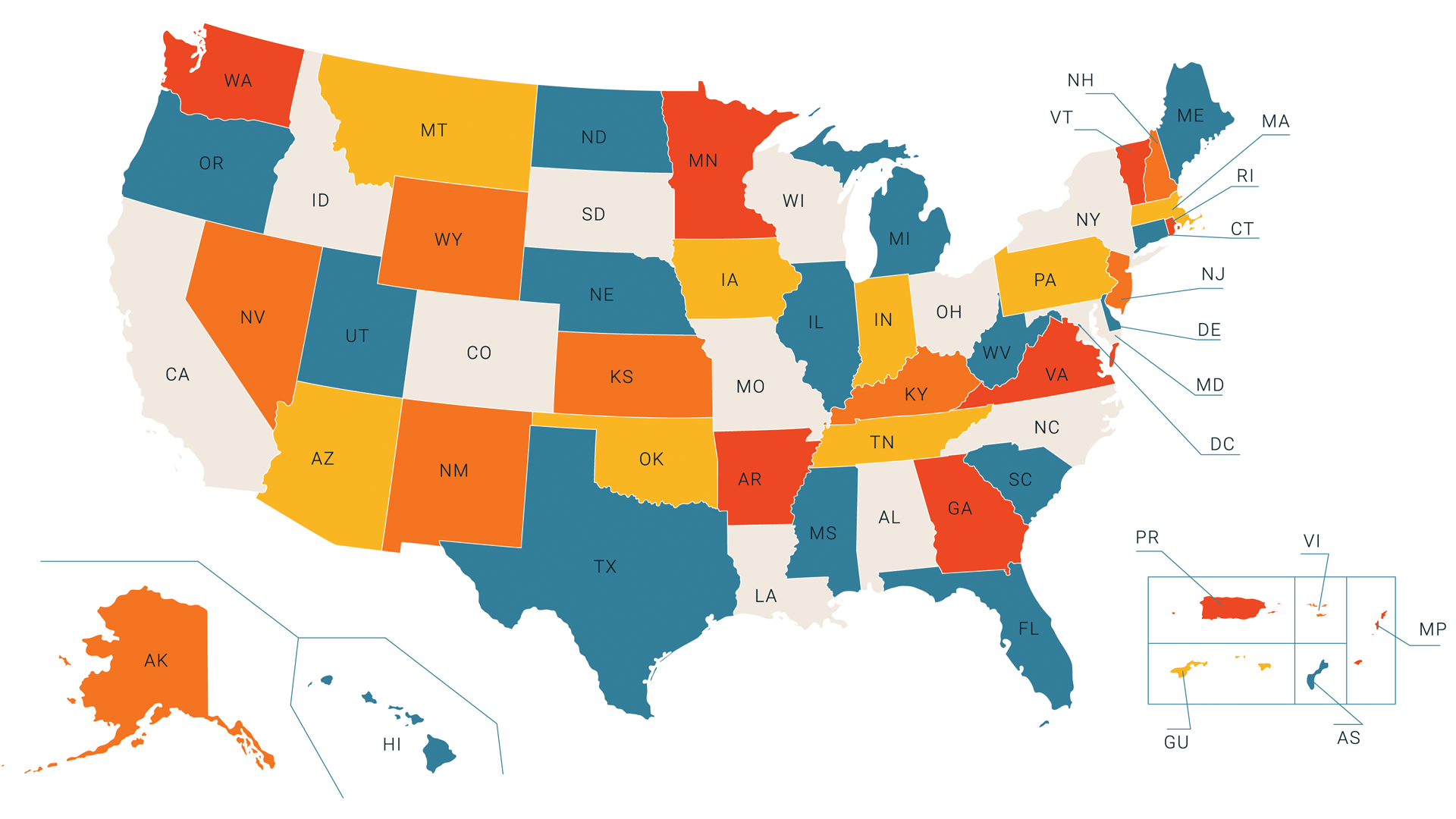
Continuing Education
Keep your electrical license
Articles
Read about all things electrician
Electrician online courses and videos
Keep your electrical license
Read about all things electrician